Operational Efficiency Metrics for Custom Software Teams
Learn which operational efficiency metrics matter for custom software and AI workflows, how to calculate them, and how to turn them into faster decisions.
A COO at a growing custom software firm opens the Monday dashboard and sees green across the board. Throughput looks steady, utilization appears healthy, and the support queue is within its target. On Friday, a customer escalation sat unanswered for nine hours. Nobody can explain why. The data exists across the ticketing platform, shared inbox, project system, and alerting tool, but no one system connected the events into a decision.
That's the operational efficiency problem after growth. Metrics get collected, but they don't get used. The right custom internal system turns a metric from a retrospective report into a trigger for routing, escalation, automation, or redesign. The wrong system gives leadership a polished view of yesterday while today's queue keeps aging.
Table of Contents
- Why Operational Efficiency Metrics Stop Working as You Grow
- The Core Metrics Every Custom Software Team Should Understand
- Selecting Metrics for Ops, Customer Success, Finance, and Fulfilment
- Benchmarks and a Worked Calculation Example
- Measurement Pitfalls and Data Requirements Most Teams Miss
- Mapping Metrics to Dashboards, Integrations, Automations, and AI Monitoring
- Turning Metrics Into Faster Decisions and Lower Recurring Cost
Why Operational Efficiency Metrics Stop Working as You Grow
Small teams can compensate for weak measurement. A founder knows which client is waiting, who owns the next action, and where a handoff went wrong. A team lead can open several tools, reconstruct the timeline, and intervene before a delay becomes visible in a report.
Growth removes that informal safety net. More people create more handoffs. More customers create more exceptions. More tools create more boundaries where timestamps disappear and ownership becomes ambiguous. The original dashboard may still calculate its numbers correctly, but its definitions were built for manual exports, single-team workflows, and leaders close enough to the work to fill in missing context.
Healthy dashboards can hide unhealthy decisions
A volume metric can rise while quality falls. A utilization metric can look strong while a team spends its day correcting bad inputs. A ticket closure count can improve while unresolved escalations move into another queue. Operational efficiency metrics fail when they describe activity without revealing the next decision.
That was the gap in the opening scenario. The firm didn't lack data. It lacked a model of the customer escalation journey. The dashboard knew a ticket existed, but it didn't know that the ticket had crossed a risk threshold, changed owner twice, waited on an integration, and remained unanswered after the promised response window.
Practical rule: If a metric doesn't change who acts, what they do, or when they do it, it's probably a reporting artifact rather than an operational control.
The distinction matters for custom software teams because internal systems encode business definitions. A dashboard can show queue age, but an integration must retrieve the events that create queue age. An automation can stamp each handoff, but an AI-assisted monitor may be needed to classify why the handoff failed and prioritize the response.
Replace vanity KPIs with decision signals
A useful metric connects four things:
- A defined event: The system knows exactly when work entered, moved through, or left a process.
- A stable denominator: The team can distinguish a meaningful rate from a flattering result based on a tiny sample.
- An accountable owner: Someone has authority to respond when the metric moves.
- A prescribed action: The system or team knows whether to route, investigate, pause, or redesign.
This article treats operational efficiency metrics as a software design decision. The objective isn't to paste a longer KPI list into a report. It's to decide which signals belong in dashboards, which need integrations, which should trigger automations, and which require AI-assisted monitoring. That's how founder-led firms replace disconnected tools with an internal system that shortens decisions and controls recurring operational cost.
The Core Metrics Every Custom Software Team Should Understand
Operational efficiency metrics measure how well a business converts inputs such as labor, time, capital, tickets, requests, or transactions into useful output. NetSuite's overview of operational KPI frameworks identifies cycle time, error rate, revenue per employee, resolution rate, and overall equipment effectiveness as common examples. The practical framing is simple: what enters the system, what leaves it, and how much waste appears between those points?
These metrics belong in a custom internal system only when each one supports a decision. Start with a small set, define the events and denominator, then connect the result to a workflow owner.
Five measures worth instrumenting
Process Cycle Efficiency, or PCE, equals value-added time divided by total lead time. If a request requires active work but spends most of its journey waiting for approval, PCE exposes the queue rather than blaming the operator. The PCE research reference describes this calculation as a direct way to measure how much elapsed workflow time creates value.
First-pass yield equals defect-free outputs divided by total outputs. It supports a decision about validation, intake quality, or workflow design. Tracked alone, it can encourage teams to reject difficult work or redefine “defect-free” too narrowly.
Cost per transaction equals fully loaded operating cost divided by transactions processed. It helps leaders compare manual handling with an integration or automation build. It becomes misleading when the cost boundary excludes oversight, exception handling, infrastructure, or rework.
Throughput per FTE equals units delivered divided by headcount. It supports capacity planning and staffing decisions. Used in isolation, it can reward speed over quality and push teams toward processing easy units while complex work accumulates.
Rework rate equals reopened or corrected units divided by total units. It identifies quality loss, unclear requirements, and fragile handoffs. A low rework rate doesn't prove a process is healthy if the system fails to capture corrections or customers stop reporting problems.
| Metric | Plain-Language Formula | Decision It Supports |
|---|---|---|
| Process Cycle Efficiency | Value-added time ÷ total lead time | Remove queues, approvals, or handoffs |
| First-pass yield | Defect-free outputs ÷ total outputs | Improve validation and input quality |
| Cost per transaction | Fully loaded operating cost ÷ transactions | Assess automation and integration economics |
| Throughput per FTE | Units delivered ÷ headcount | Plan capacity and allocate resources |
| Rework rate | Reopened or corrected units ÷ total units | Redesign quality controls and handoffs |
Design the metric into the workflow
A metric should be created at the moment its underlying event occurs. A custom request system can record intake time, assignment time, first action, approval, completion, reopening, and final closure. That event trail makes the metric reproducible. A manually entered “completion date” doesn't.
OEE offers the same lesson in manufacturing and service operations. Its standard structure, availability × performance × quality, compresses downtime, speed loss, and defects into one measure, but the three components still need reliable operational events. A single percentage can summarize a process, yet it shouldn't replace the underlying signals that tell a software team what to change.
Selecting Metrics for Ops, Customer Success, Finance, and Fulfilment
The same metric changes meaning when the workflow changes. Operations leaders care about queues and handoffs. Customer success leaders care about whether a request is resolved without repeated contact. Finance leaders need a trustworthy cost and defect boundary. Fulfilment leaders balance flow with exception handling and completion reliability.
That's why a shared executive dashboard shouldn't be the primary operating surface. Role-specific dashboards should expose the metric, its context, and the action available to that team.
| Team | Priority Metric | Team-Specific Input / Denominator | Decision It Feeds |
|---|---|---|---|
| Operations | Process cycle efficiency and rework rate | Value-added time, total lead time, reopened internal work | Remove queues and redesign handoffs |
| Customer Success | First-pass resolution and cost per resolved ticket | Tickets resolved on first interaction, fully loaded support cost | Improve routing, knowledge capture, or escalation rules |
| Finance | Cost per transaction and reconciliation defect rate | Processing cost, completed transactions, corrected reconciliations | Automate controls and prioritize close-cycle improvements |
| Fulfilment | Throughput per FTE and exception rate | Completed units, fulfilment headcount, exception cases | Reallocate capacity and route operational failures |
Operations needs the workflow timeline
An operations dashboard should show where work waits, not just how much work closes. A custom admin panel can display queue age by owner, handoff count, blocked reason, and rework history. An integration with the project system and customer system can preserve the full path, so a rising cycle time points to a specific boundary instead of triggering a vague productivity conversation.
Customer success needs quality-adjusted resolution
A support team that closes tickets quickly may still create renewal risk if customers reopen cases or contact the company again. First-pass resolution and cost per resolved ticket provide a better design brief for an AI triage workflow. The system can classify intent, retrieve relevant account context, propose a response, and route only uncertain or high-risk cases to a human.
A practical reference point for this type of build is the client portfolio agent project, which illustrates how a custom internal workflow can bring decision support into the operating surface rather than forcing teams to assemble context manually.
Finance and fulfilment need reliable boundaries
Finance needs explicit definitions for what counts as a transaction and which labor and system costs belong in the calculation. Fulfilment needs a clean distinction between completed work and exceptions. An order marked “processed” before payment reconciliation, inventory confirmation, or shipment validation will make throughput look better while moving work into hidden queues.
The definitions remain stable, but inputs, denominators, and decision thresholds shift by team. Encode those differences in role-specific views, not in separate unofficial formulas that drift across tools.
Benchmarks and a Worked Calculation Example
Benchmarks can help a custom software lead challenge an implausible result, but they shouldn't become targets without context. Cycle time varies by workflow complexity. First-pass yield depends on the quality boundary. Cost per transaction changes with labor mix and exception volume. Rework rate depends on what the system captures as a correction.
Use external comparisons as a sanity check, then rely on internal history and peer comparisons for design decisions. Long-running benchmarking programs support that approach. McKinsey's operational efficiency work describes more than 25 years of proprietary performance insights across global upstream assets, including operating expenditures, production efficiency, deferments, safety, and emissions. The UK Operational Efficiency Programme dataset documents government-function benchmarking from April 2009 to May 2010. These examples show why trends and comparable populations matter more than one universal target.
| Metric | Ops | Customer Success | Finance | Fulfilment |
|---|---|---|---|---|
| Cycle time | Queue-to-completion duration | Request-to-resolution duration | Submission-to-reconciliation duration | Order-to-completion duration |
| First-pass yield | Work accepted without correction | Request resolved without repeat contact | Reconciliation completed without adjustment | Order completed without exception |
| Cost per transaction | Cost per processed work item | Cost per resolved customer request | Cost per reconciled transaction | Cost per fulfilled order |
| Rework rate | Reopened internal work | Reopened or escalated request | Corrected reconciliation | Order requiring correction or recovery |
A fulfilment pipeline example
Suppose a fulfilment team's internal system logs a workflow with 100 total labor hours, 500 completed transactions, and 20 hours of value-added work. It also records 40 transactions requiring correction, so the rework rate is:
- Rework rate = corrected transactions ÷ completed transactions
- Rework rate = 40 ÷ 500
- Rework rate = 8%
For PCE:
- PCE = value-added time ÷ total lead time
- PCE = 20 hours ÷ 100 hours
- PCE = 20%
If the fully loaded operating cost for the measured period is $5,000, cost per transaction is:
- Cost per transaction = fully loaded cost ÷ transactions
- Cost per transaction = $5,000 ÷ 500
- Cost per transaction = $10
Those figures point to a structural issue. The team's active work is a small share of elapsed workflow time, and correction volume is large enough to deserve a cause analysis. The next build shouldn't begin with a prettier chart. It should instrument approval waits, data validation, exception reasons, and human versus automated handling so the system can remove the queue and prevent the defects.
Automation can be powerful when the process is repeatable and rule-based. In an n8n workflow automation study, average execution time fell from 185.35 seconds manually to 1.23 seconds automatically, an approximately 151× reduction, while the evaluation also considered error rate and stability. That result supports measuring reliability alongside speed, not assuming speed alone proves efficiency.
Measurement Pitfalls and Data Requirements Most Teams Miss
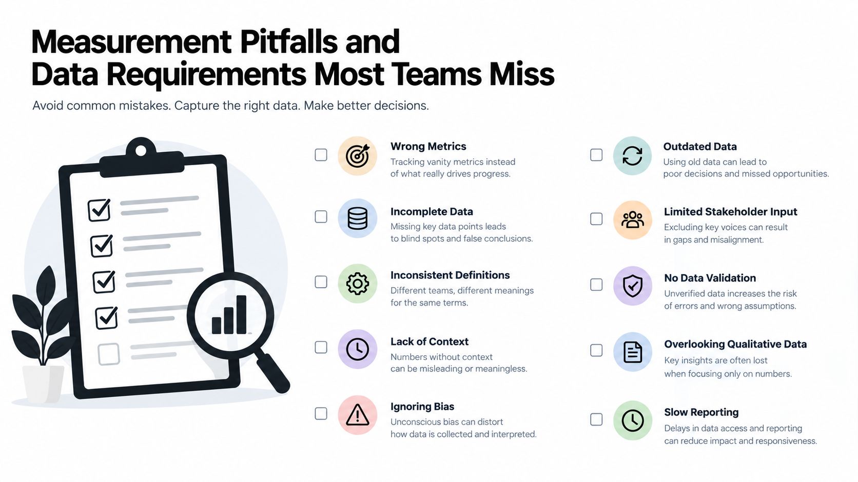
Most metric programs don't fail because leaders selected a terrible KPI. They fail because the system can't produce a trustworthy value, or because nobody has a defined response when the value changes.
A metric definition can drift between a ticketing tool, a billing system, and an internal dashboard. A timestamp may record when a person noticed an event rather than when the event happened. A manual field may be filled in at the end of the week, after memory and incentives have already shaped the result. Rate-based measures can also conceal a weak denominator, making a small number of successful cases look like stable performance.
Build the data contract before the dashboard
Each metric family needs a minimum technical foundation:
- Stable event IDs: Every request, transaction, case, and order needs an identifier that survives integrations and status changes.
- Immutable event timestamps: Record creation, assignment, action, approval, completion, reopening, and exception events at the system boundary.
- Joined business context: Link customer, account, transaction, owner, service level, and outcome data without forcing an operator to re-enter it.
- Human and automation attribution: An automation registry should record whether a bot, AI agent, integration, or human performed each action.
- Definition versioning: Preserve changes to status logic, denominator rules, and exclusion criteria so historical comparisons remain interpretable.
APQC's 2025 operational KPI priorities and challenges highlights the practical difficulty of selecting useful KPIs, obtaining reliable data, and getting people to use the measures. That adoption lens is more valuable than another generic KPI list. A metric counts only when a named role reviews it on a recurring cadence and has authority to act.
Questions to ask before the next build
Ask where each event originates, who owns its accuracy, and whether an integration can capture it automatically. Check whether the denominator excludes cancelled, duplicate, or abandoned work consistently. Test whether an operator can trace an outlier back to the underlying record without opening several disconnected tools.
A metric without a trustworthy event trail is an opinion with formatting.
Run the audit on a sample of completed and failed workflows. Compare system timestamps with the actual business boundary, inspect reopened work, and identify every manual correction. If the team can't explain the number from its source events, don't put it on an executive dashboard yet.
Mapping Metrics to Dashboards, Integrations, Automations, and AI Monitoring
Different metrics require different software patterns. A dashboard is useful for visibility, but it can't repair missing events. An integration creates the connected data flow, an automation executes repeatable logic, and AI monitoring helps interpret patterns or prioritize exceptions.
Put each metric in the right layer
Aggregate health metrics belong on dashboards. Throughput, cost per transaction, rework rate, and PCE can give an operations lead a useful view of trend, owner, and segment. The dashboard should support drill-down. A red rate without the underlying cases only creates another meeting.
Workflow metrics belong in integrations and automations. Cycle time needs timestamps from every meaningful handoff. An integration can bring events from the customer platform, project system, billing service, and fulfilment tool into one process model. An automation can start timers, enforce required fields, route approvals, and reopen work when a correction occurs.
Cost metrics need attribution. The system must distinguish human handling, automated execution, exception review, and platform cost. Without that registry, an automation may appear cheap because the manual cleanup happens outside the measured workflow.
Anomaly metrics are a strong AI use case. An AI monitor can examine historical labels, summarize the reason for a delay, and rank cases by risk. It shouldn't make high-impact decisions without a defined confidence threshold, audit trail, and human escalation path.
Example of an exception-routing agent
An internal operations system can watch for SLA breach risk, classify the likely cause from historical labels, and push a prioritized queue to the on-call lead. A request blocked by missing customer data can follow one route. A repeated integration failure can follow another. A high-risk account with multiple reopened cases can escalate to a senior owner instead of waiting in the general queue.
This pattern is more useful than a generic chatbot because it connects classification, routing, action, and measurement. The system can measure queue age before and after routing, exception rate by cause, human review volume, and rework after the agent's recommendation.
A comparable implementation context is an insurance operations dashboard, where the value of a custom surface lies in connecting operational records to decisions rather than merely displaying isolated totals.
Agentic AI is increasingly relevant to production workflows. A 2026 enterprise survey summary reports 42% of organizations with agentic AI in production, 72% with production and pilot deployments combined, and 91% of CXOs planning to increase agentic AI budgets in 2026. These figures don't prove that every workflow needs an agent. They do reinforce the need to design governance, handoffs, and monitoring into production systems from the start.
Turning Metrics Into Faster Decisions and Lower Recurring Cost
Founder-led firms don't buy operational software to admire charts. They buy it to reduce the time between a signal and a decision, then reduce the recurring labor required to manage the same process.
The metric creates value when it closes a loop. A rising queue-age signal should trigger prioritization. A rework pattern should open a process investigation. A cost-per-transaction increase should expose whether volume, labor, exceptions, or integration failures caused it. The dashboard is only the visible part. The economic outcome comes from the action attached to the signal.
A practical build checklist
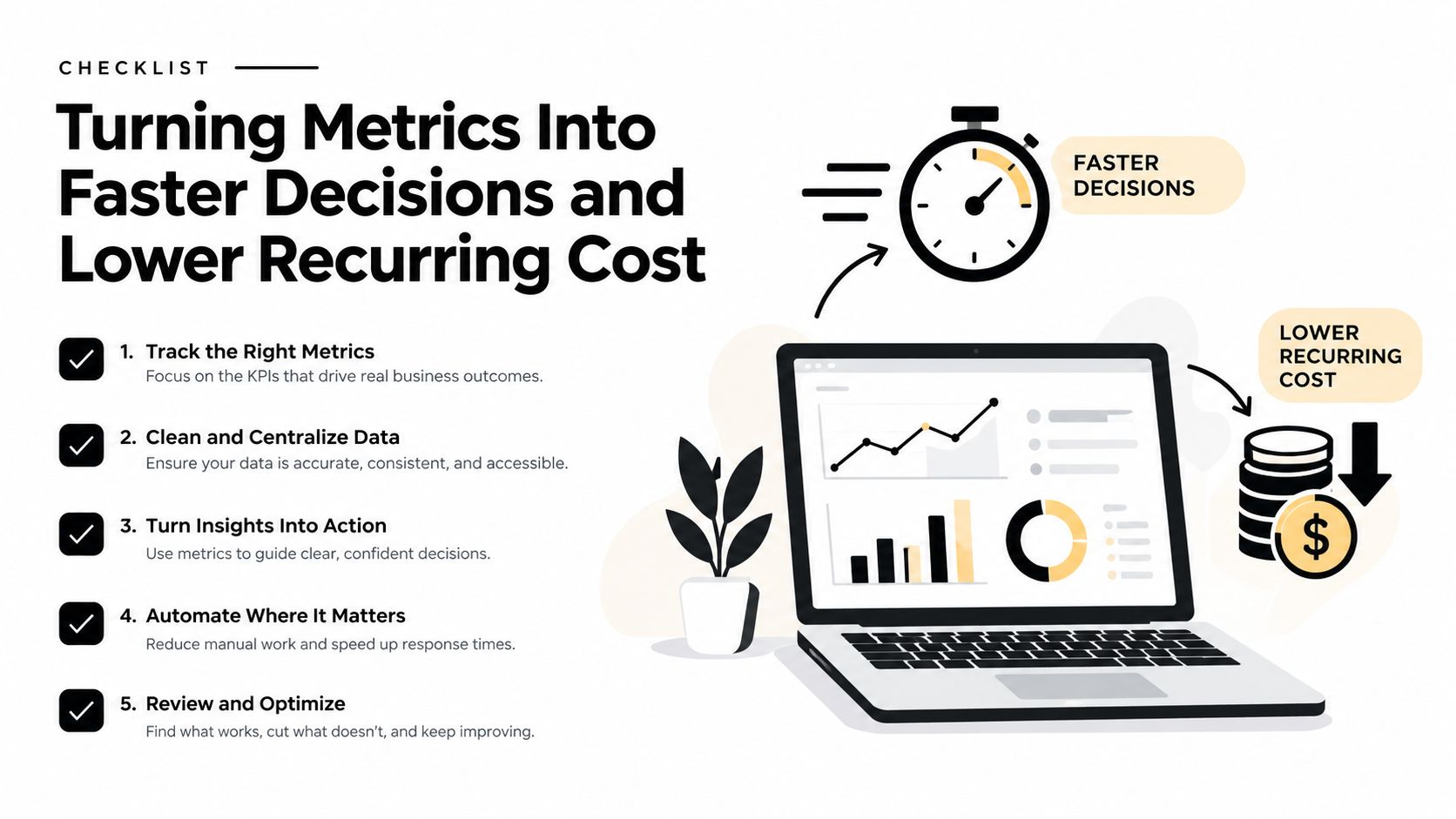
- Instrument the constraint first. Start with the workflow where waiting, rework, exception volume, or decision latency creates visible operating pain. Don't begin with the metric that's easiest to export.
- Define the event boundary. Write down when work starts, when value-added work begins, what counts as completion, and what creates rework.
- Choose the software pattern. Use a dashboard for visibility, integrations for source synchronization, automations for deterministic steps, and AI monitoring for classification, prioritization, and anomaly interpretation.
- Assign an operating owner. The person receiving the alert must have the authority and context to act. Otherwise, the system will generate noise.
- Review the metric set after the first quarter. Retire measures that don't change decisions. Split measures that hide important segments. Keep the smallest set that reliably drives action.
Partial automation deserves special scrutiny. A 2025 workflow automation analysis reports that 66% of organizations have automated multiple functions, while only 4% have fully automated workflows. Another source in the same coverage reports 33% reaching production scale, with ROI, cycle-time reduction, and error reduction used to demonstrate value. The implication is practical: measure whether automation removes operational load end to end, not whether one step runs faster.
When evaluating custom software against a packaged AI tool, compare control, integration depth, ownership, and exception handling, not only the feature list. The build-versus-buy AI tooling comparison is useful when a team needs to decide whether the workflow's economics justify custom ownership.
Decision test: If the metric improves but the queue, rework, or leadership bottleneck remains, the system optimized a component instead of the operation.
For AI agents, the shift is toward embedded, task-specific behavior. A 2026 enterprise AI agents summary projects that 40% of enterprise applications will embed task-specific AI agents by the end of 2026, up from under 5% in 2025. That supports building classification, summarization, and next-action recommendations into the internal system where the work happens, provided the workflow retains auditability and human control.
Internal Systems diagnoses recurring workflows, designs the data and architecture, and builds custom dashboards, integrations, automations, and AI-powered workflows for operational teams. If your metrics are trapped across disconnected tools or your leaders still triage exceptions manually, visit Internal Systems to turn those signals into a working internal system.